2007-2015 Germany - TimoCom GmbH
Lead Graphic Product UX Designer
Synergy makes impossible usable
When I started at TimoCom in 2007, this growing tech company was already Europe's most successful digital freight exchange. From the marketing department, I made my way through the development department and to the innovation team.

The Aurora project
Complexity Topics
Topic 01
Target group and challenges
- The majority of TimoCom's business customers were employees in forwarding companies, who had the task of safely and efficiently managing freight and trucks through Europe. Today, the platform has customers from 44 European countries and supports 25 languages.
- The freight exchange platform was part of our users' day to day professional job.
Target group and challenges
Key findings from observations
- The main task of our users was observing the market for either offers of freight or empty space in trucks. Every row, representing an offer in the result table of our platform, was necessary and could hold the next important deal. Therefore, big monitors were a must.
- The update button above the offer table was sometimes pressed several times during a second to update it, as new offers were not automatically displayed.
Target group and challenges
Limited filter options
- A common complaint was the limited way of finding offers with the filter of our software. It was only possible to find something in a specified square around the start and end points of a route.
- But with an empty truck, it would often make sense to find freight in the middle of, or along a route to not drive completely empty.
Target group and challenges
Multiple products for one user journey
- Even if customers were paying a flat rate for the whole package, the platform was split into five main products. The UX on each product was quite different, but the main user group needed minimum two of those to do their daily job.
- Many products were built on different software platforms and didn't consider up to date web technology.
Target group and challenges
No responsive UI design
- In the four years before we started with the new innovation team, I was able to build a good team of product designers. Within the structure of the development department, it was not possible for us to introduce new modern UI and UX designs methods. For example, our icon were still delivered in PNG or GIF format with a resolution of 16x16 pixels.
- Although we in the design team came up with ideas to change this, it was difficult to find allies.
Topic 02
Innovation team for Aurora
- To finally give space for an innovative approach, TimoCom founded the new sub company Ticonex and a new innovation team within. All that was missing was someone who can kick off a new design area in the new cross functional team.
- With my certification as Usability Engineer in 2012 I saw the opportunity to use these new UX methods to support Ticonex to innovate successfully.
Innovation team for Aurora
The streak of light
- Under the new project name Aurora at Ticonex, we were able to start from scratch. Our task was to find solutions for the pain points and challenges described under the previous topic 'Target group and challenges'.
- We were allowed to decide ourselves which methods we wanted to use and which web technologies would offer the best solutions for our users' problems.
Topic 03
New UX, tech, agile and research
- It felt like everything was turned upside down. Instead of the in-house chat software, we introduced Slack for example. Java had to make way for Angular, NodeJS and more modern web technologies. Prototypes were no longer created in Photoshop to handover to our developers.
- I learned to create user flows and designs on a Samsung Note tablet and how to implement these ideas directly into code.
New UX, tech, agile and research
Introducing measurement of success
- Following design thinking principles we wanted to be able to test and measure the success of an experiment for every design sprint. To get quantitative data we always planned where we could add a tracker into the code and defined what a success would look like. In the beginning we offered our customers a beta version with dummy data.
- But to really get customers in front of the screen to test our software, we quickly connected real data via API.
New UX, tech, agile and research
Qualitative feedback from B2B customers
- What we did not have in the cross functional team, was a user researcher. Since we built this web app for B2B customers, there was no way around getting in touch directly with them. Luckily I was able to convince members of the sales team to organise regular user testing.
- Together we built a loop of regular user surveys with real customers to get first hand qualitative data.
Topic 04
UX Solutions for our customers
- With the regular input from user testing and the already observed pain points before project Aurora, we had a full backlog to prioritise. On the screenshot on this page you can see an early stage of our new layout. It may not be sleek yet, but we practiced the new rapid way of prototyping with digital sketches and direct code implementation.
- Find on the following slides the solutions we created to follow customer needs.
UX Solutions for our customers
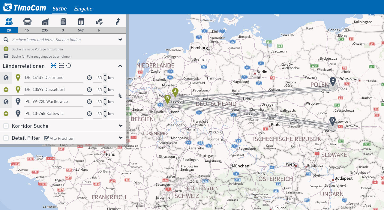
User journey starts from the left 1 of 3
- For our main user group their job with our software started with the filter on top of the result table. In the last 4 years as product designers at TimoCom, we have created a very compressed filter layout over hundreds of iterations. Over the course of the years, customers had also wanted to incorporate their favorite filters.
- Sadly, this was impossible with the current, non responsive UI.
UX Solutions for our customers
User journey starts from the left 2 of 3
- With the knowledge that more users are using monitors with a higher resolution compared to 1024x768px, we decided to give the filter unlimited space in the vertical on the left. In one big scoop, the new UX design made it possible to have enough space to create understandable new components such as the “Favorites” or “Search along the route” area.
- Doing it this way also allowed to have a clear user journey, starting with the first thing our users do from the left side.
UX Solutions for our customers
User journey starts from the left 3 of 3
- What is now visible on the screenshot is a new freight search filter. In this new design we could finally replace 16x16px icons with labels like 'Lademeter' in German. How the 16x16 pixels of an icon can be used best to display information for users has been a source of endless discussion.
- To be able to simply write down the right label in the right language in many places solved many endless conflicts.
UX Solutions for our customers
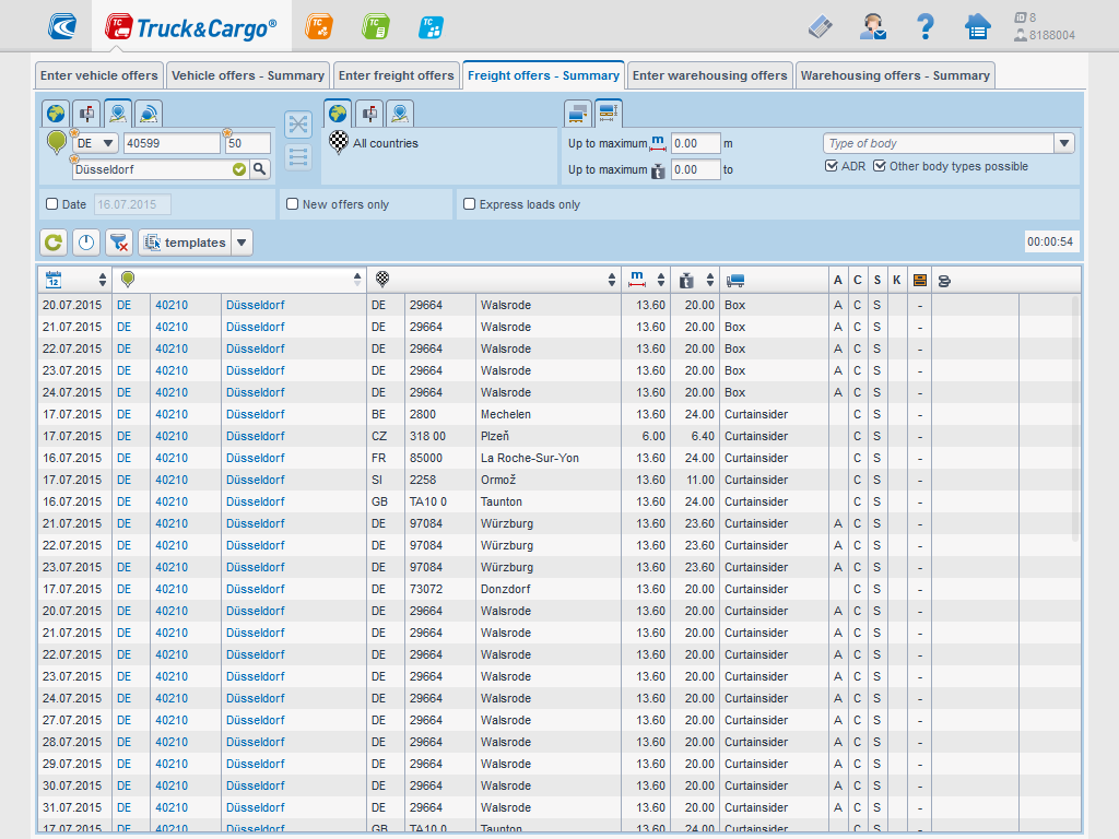
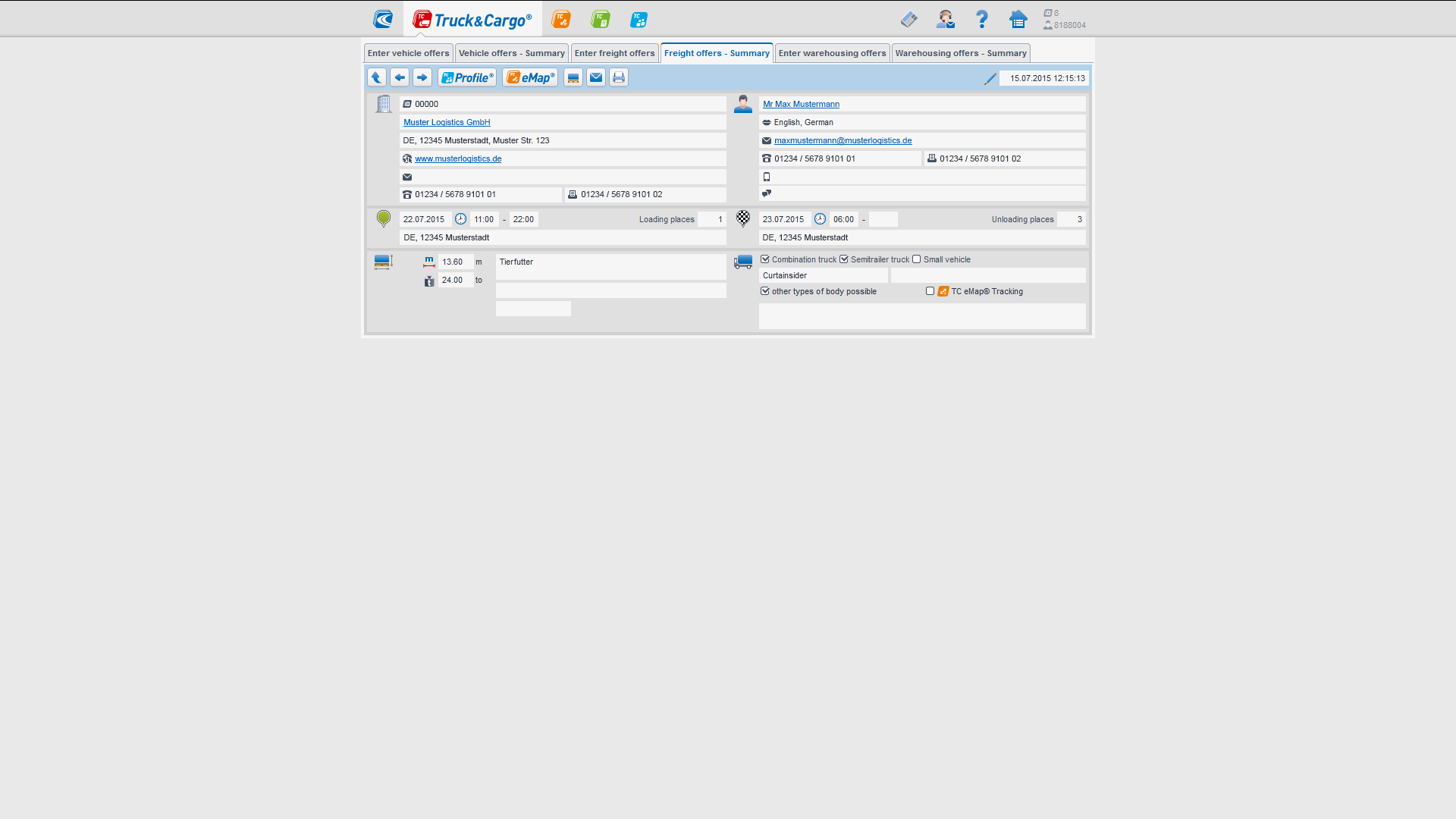
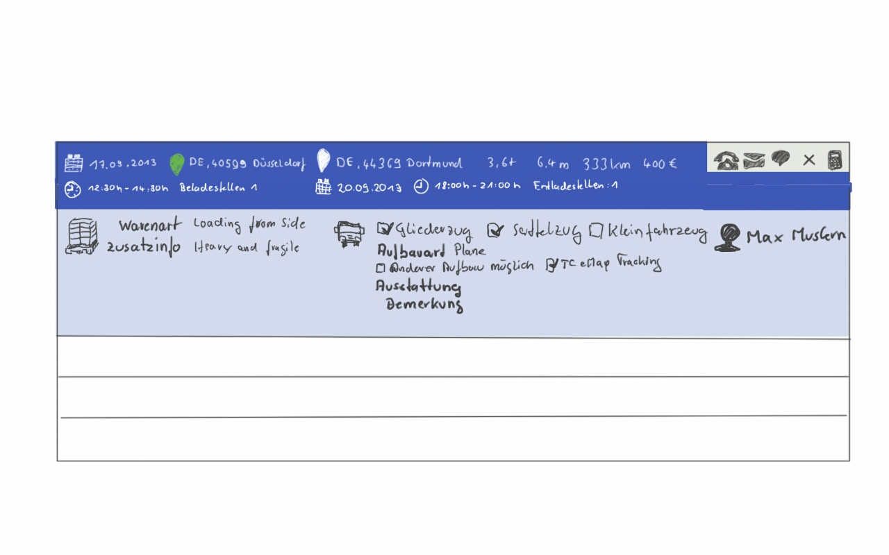
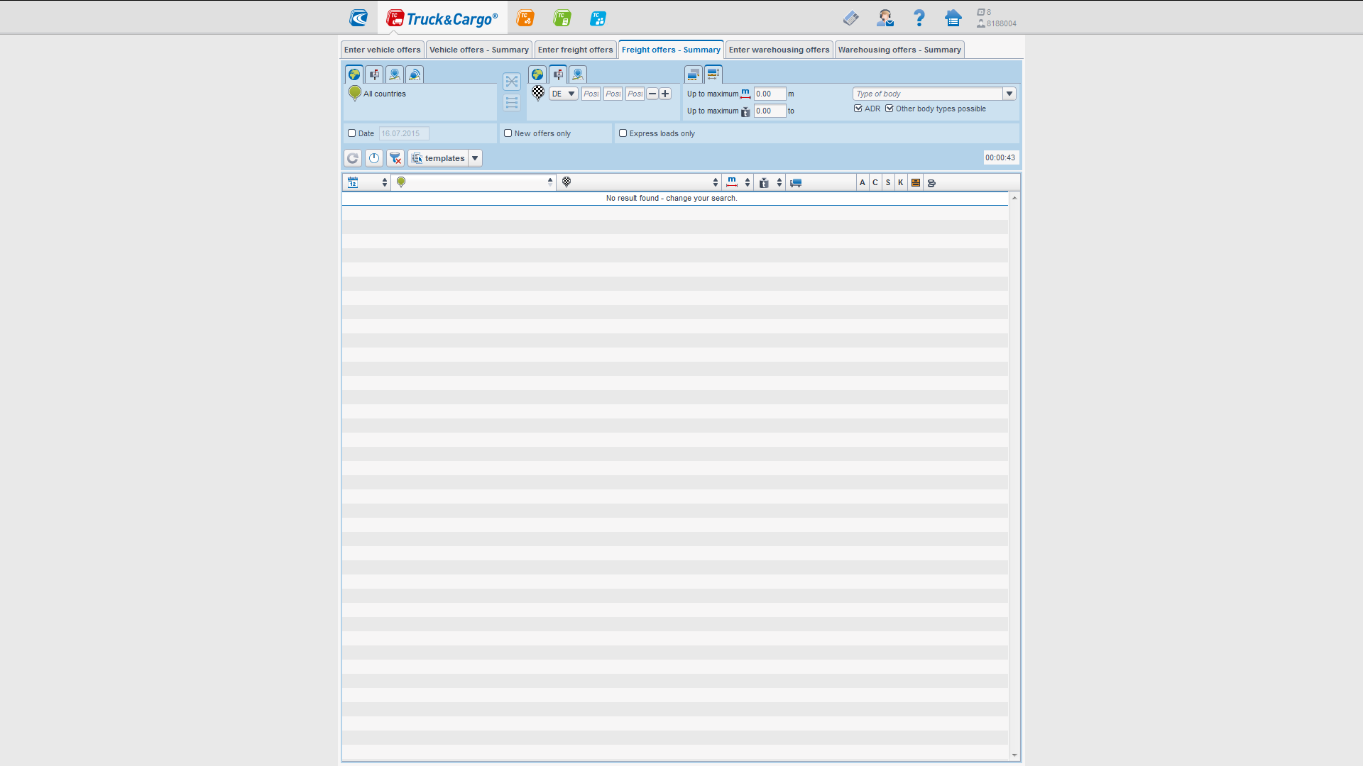
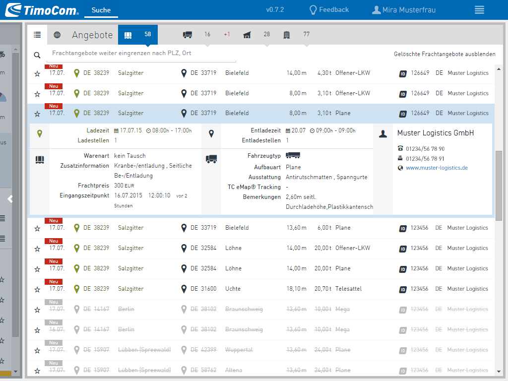
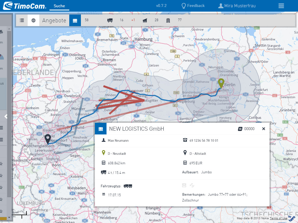
Modern, responsive offer table 1 of 3
- On the screenshot you can see TimoCom's best selling product Truck&Cargo from 2014 in HD resolution. You can see a freight offer detail view which pops up after clicking on a row in the freight offer table before. When looking at this a user might miss a new, more relevant offer.
- Users would need a solution that would allow them to check a freight offer detail while being able to notice when a new offer is available.
UX Solutions for our customers
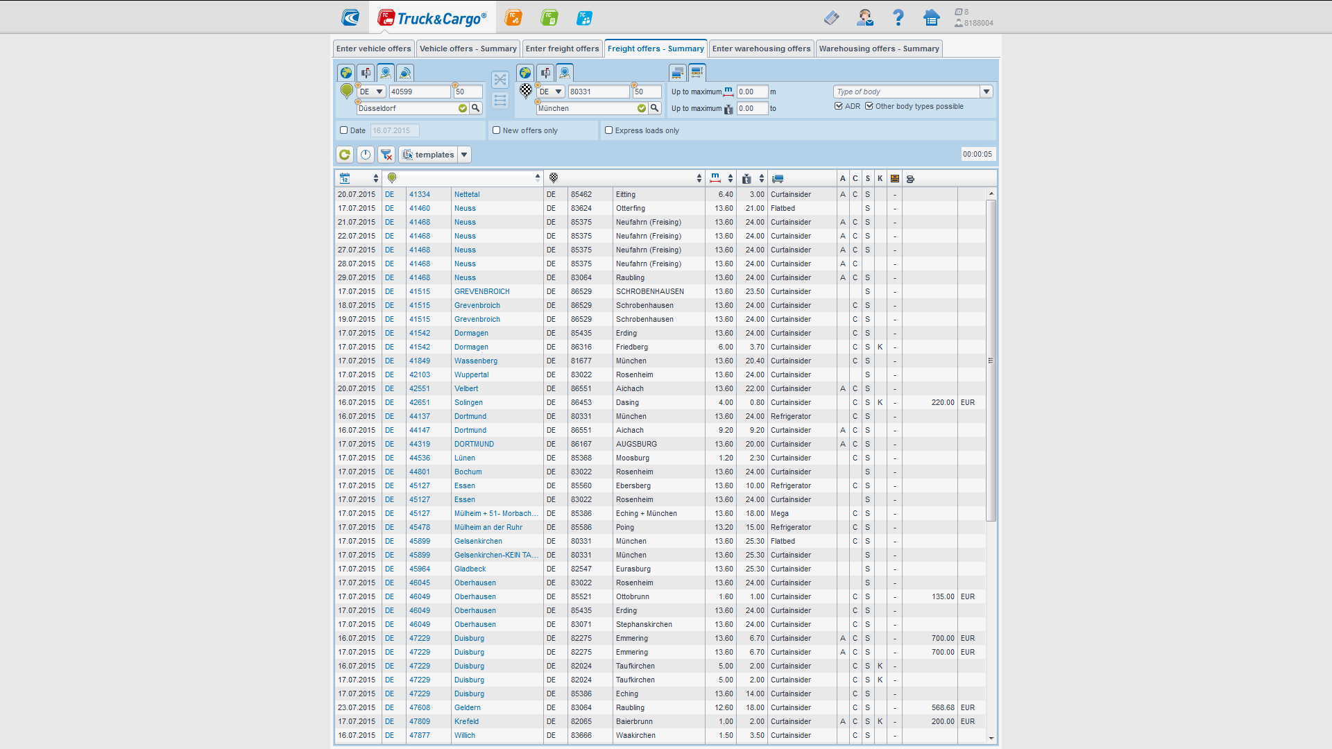
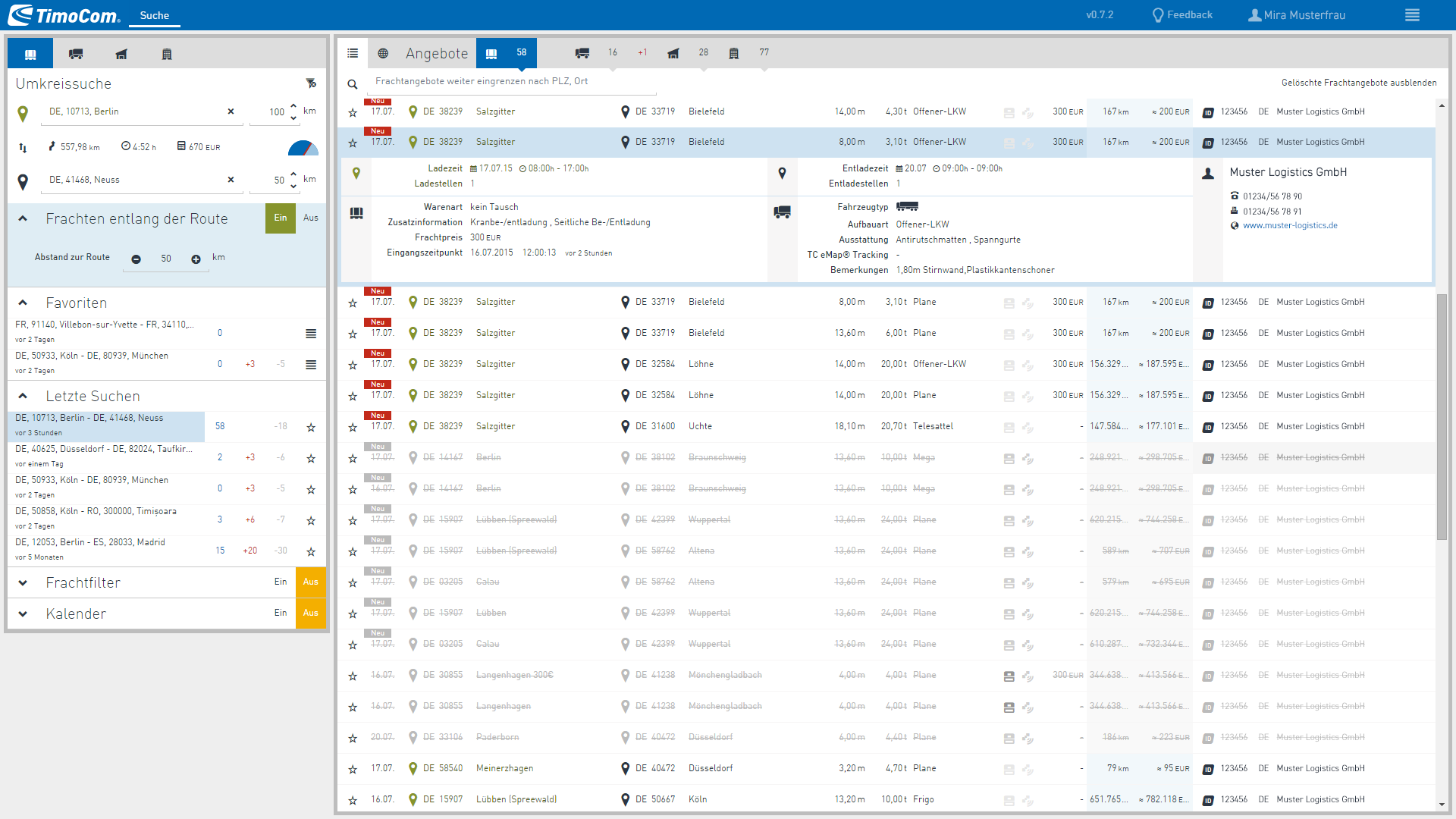
Modern, responsive offer table 2 of 3
- After a couple of iterations we created the UI on this screenshot. The freight offer table uses nearly the whole width of the HD resolution of a screen. Loading the freight offer detail when requested made it possible to render the freight offer table similarly fast to the original product.
- New offers were immediately visible with the signal red flag 'New' and the table could easily be operated with the keyboard.
UX Solutions for our customers
Modern, responsive offer table 3 of 3
- The flexible new responsive frontend design allowed the same positive experience advantage even for tablets without retina resolution. This was interesting because, we identified a new target group. Self-driving hauliers who drive their trucks themselves and want to ensure that empty journeys are avoided.
- With this design, the truck drivers were able to search for orders on a tablet PC.
UX Solutions for our customers
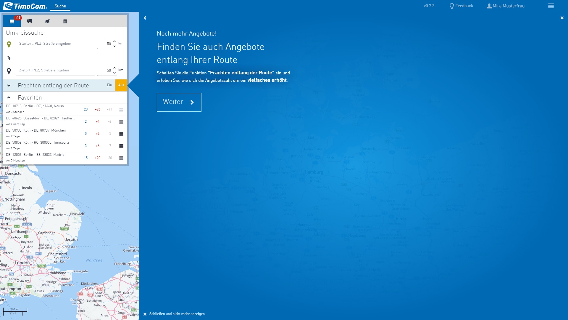
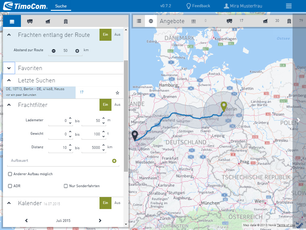
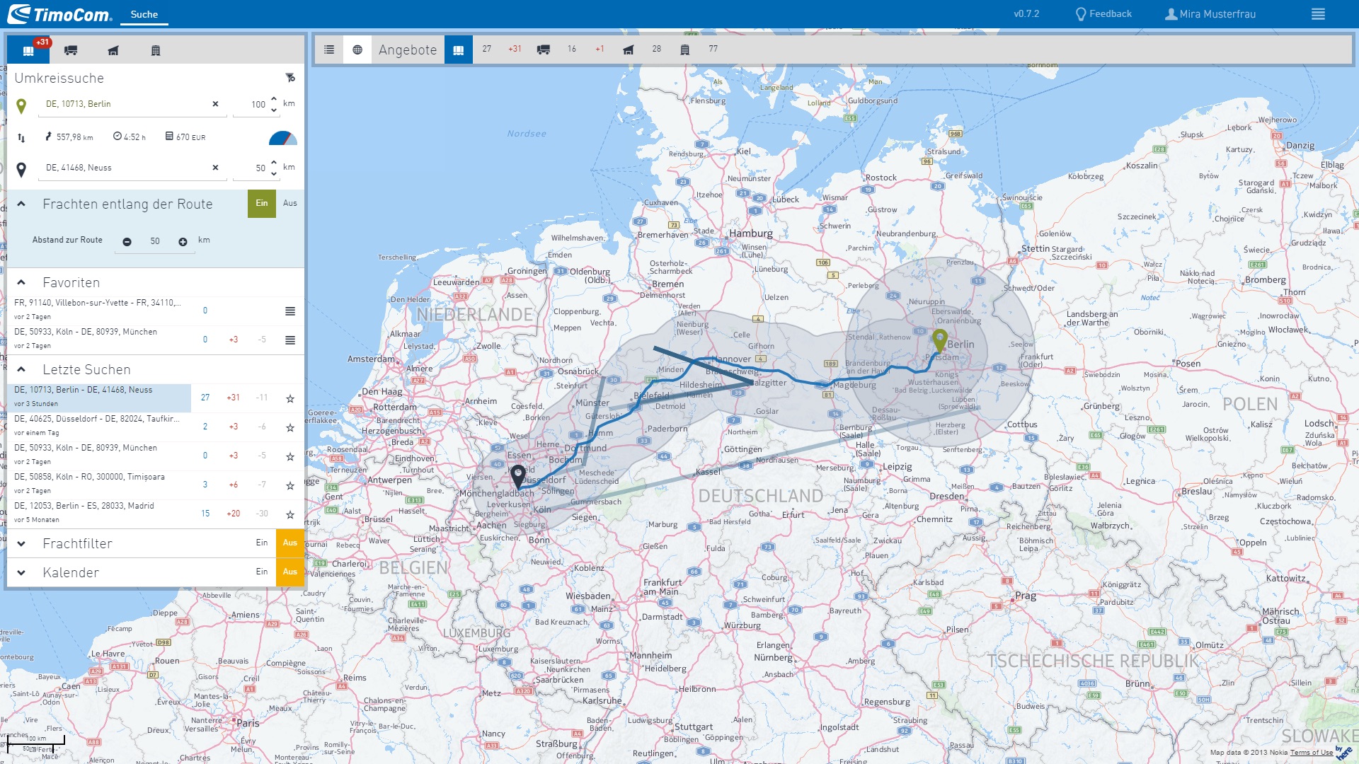
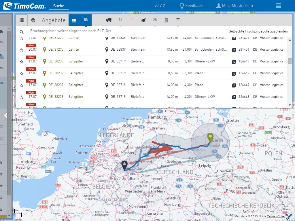
New map view for more results 1 of 3
- The most important argument for buying TimoCom software was the amount of offers users can find on it. As mentioned before a lot of opportunities couldn't be found because of the limitations of the filter.
- The idea was finding more offers along the route and visualise this with an integrated map view.
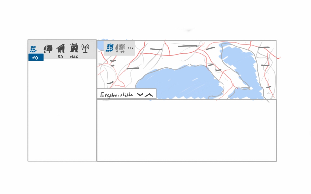
UX Solutions for our customers
New map view for more results 2 of 3
- The map you can see with the search along the route is a result after many iterations. I had to learn how to manipulate the map with parameters to only show the important information to our users.
- In a couple of user tests we found that this is the best combination of colours and components.
UX Solutions for our customers
New map view for more results 3 of 3
- This approach had many advantages, such as color matching the route on the map with the 'New' label in a row of offers. With this view it was now possible to seamlessly integrate another TimoCom product. Not so long ago TimoCom had released TC eMap, a software that would allow one to track freight and trucks.
- This opened the door to users being able to see where a truck or cargo is located even after completing an order.
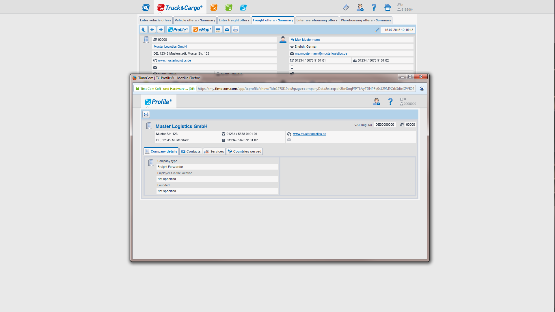
UX Solutions for our customers
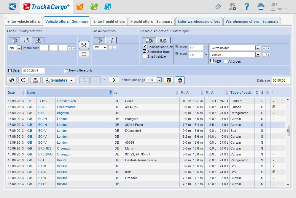
The last step on the right 1 of 3
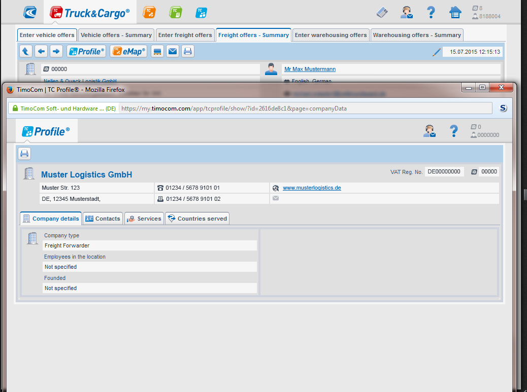
- During observations we discovered that our main user group very often checked the profile of a company behind an offer. On the screenshot you can see that users of the old platform were only able to do this by opening another product in a new window. Again, the space of an HD resolution was not used.
- This user flow made it difficult for users to work through the providers profiles quickly.
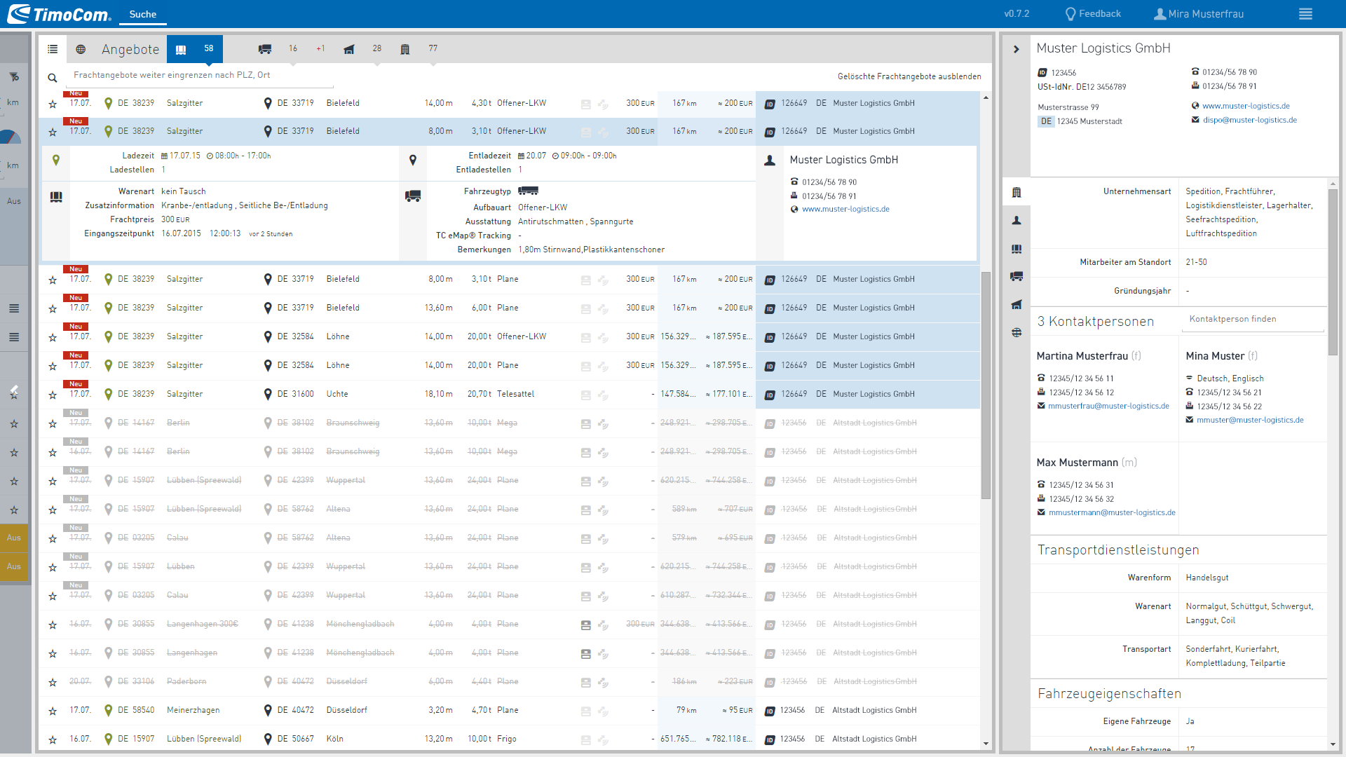
UX Solutions for our customers
The last step on the right 2 of 3
- The new UI allowed to switch easy between the different user profiles. With this approach users started on the left with the filter and ended on the right with the last step of checking company details. Our target group loved using this UI with quick keyboard shortcuts we supported.
- Plus, it is very easy for users to recognise new offers that arrive because a second window is no longer hiding them.
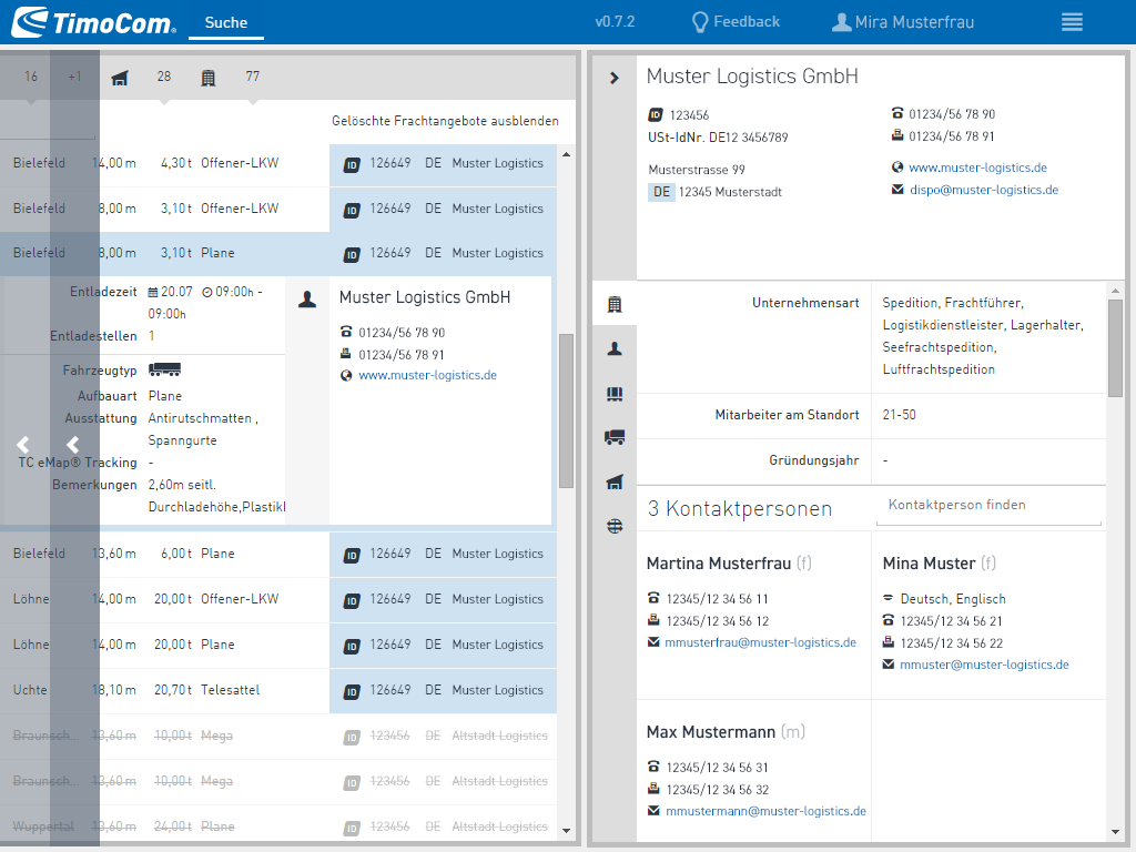
UX Solutions for our customers
The last step on the right 3 of 3
- Whatever resolution your screen has, the new responsive UX/UI design made it possible that every user could enjoy the new features. In particular, the new feature of quickly scrolling to the information you are looking for by clicking on an icon has made room for even more innovations.
- After so many iterations we have reached a level with a much easier to use software to deliver even more innovative solutions for our customers.
UX Solutions for our customers
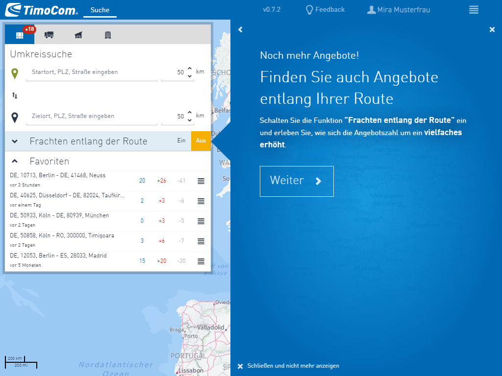
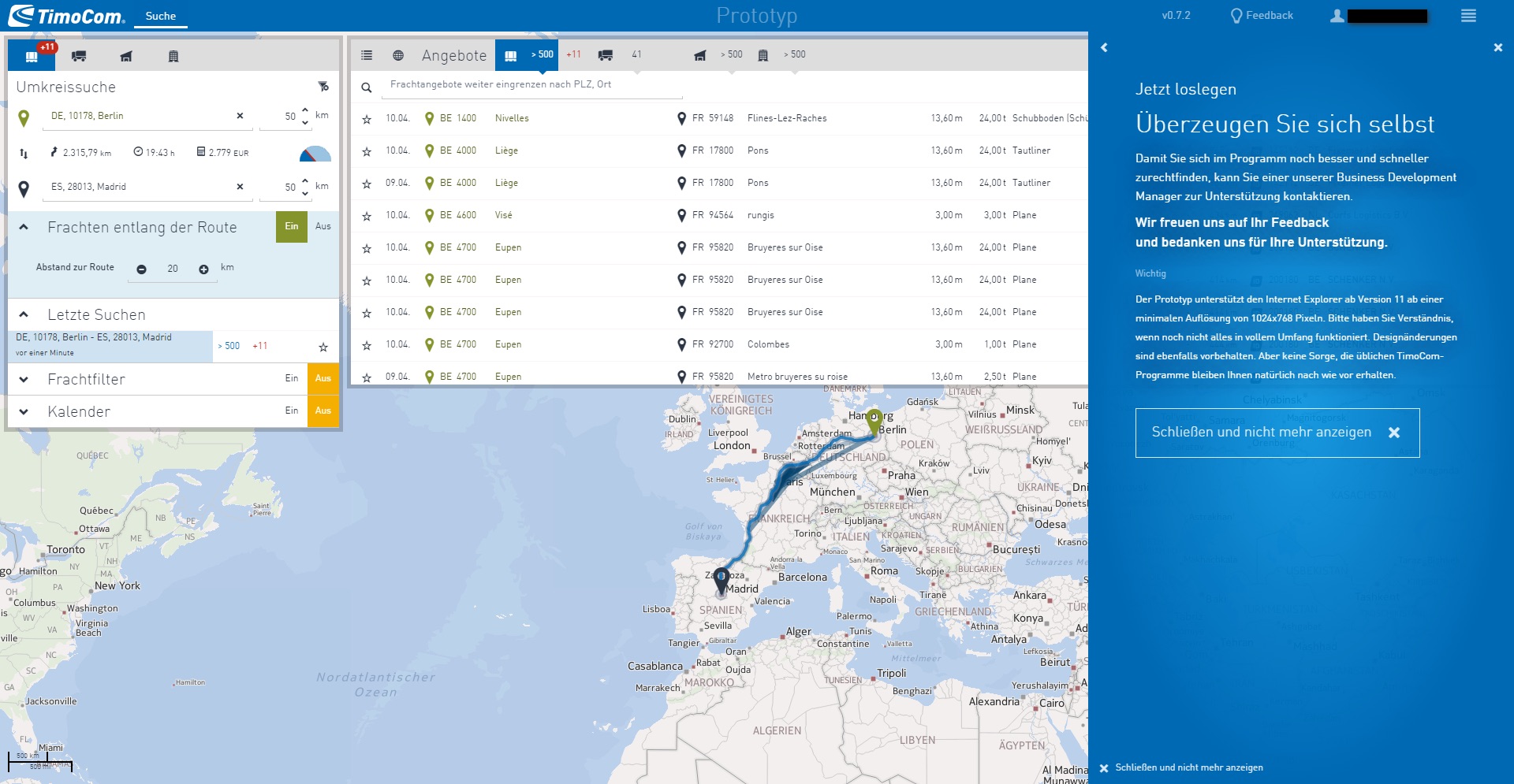
Automated onboarding 1 of 3
- Next step for us was making the onboarding for new customers easier. It was a common customer complaint that it was taking too long for users until they were able to work productively with our software. Especially the many small icons without a label, caused difficulties.
- On the screenshot you can see the welcome page onboarding screen pointing on the new, most wished 'Find offers along the route' filter.
UX Solutions for our customers
Automated onboarding 2 of 3
- What we learned from marketing is that we caught our customers' attention in real ads by showing real offers live from our platform. In the screenshot you can see a detailed text that uses the current data to explain how it works.
- Since our customers were often very sure that they understood the user interface without an explanation, we always offered a button to close the onboarding screen once and for all.
UX Solutions for our customers
Automated onboarding 3 of 3
- This last screen of the onboarding is also an advertisement to use the software. It also offers personal support from our business development team.
- But with this new onboarding and UX design, business development was no longer in demand as often as with the old product.
Topic 05
Success story
- In mid-2015, the innovation department was reintegrated into TimoCom's normal development department. Many of the ideas that we developed for project Aurora, such as the map as a way to safely track freight and trucks, are now part of the new TimoCom Smart Logistics System.
- Even after years, I am proud of what we have achieved as a team for the company.