Data driven success culture
Conversion Topics
Topic 01
Working at Rentalcars.com
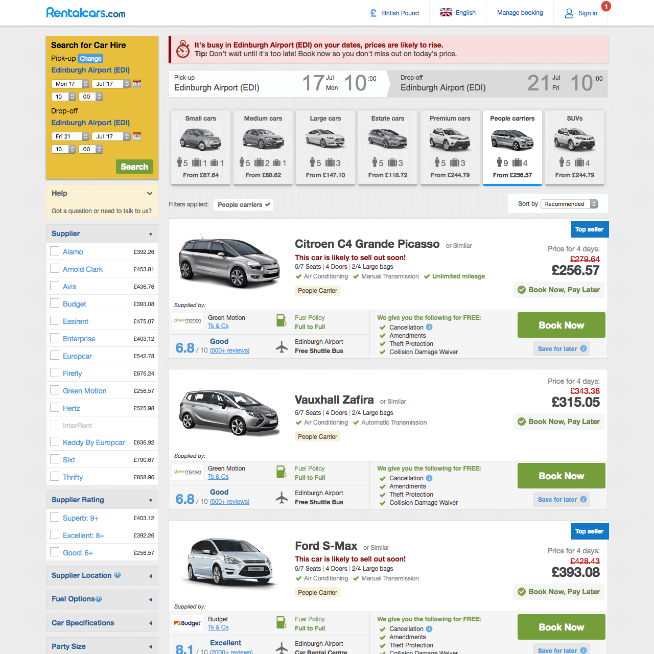
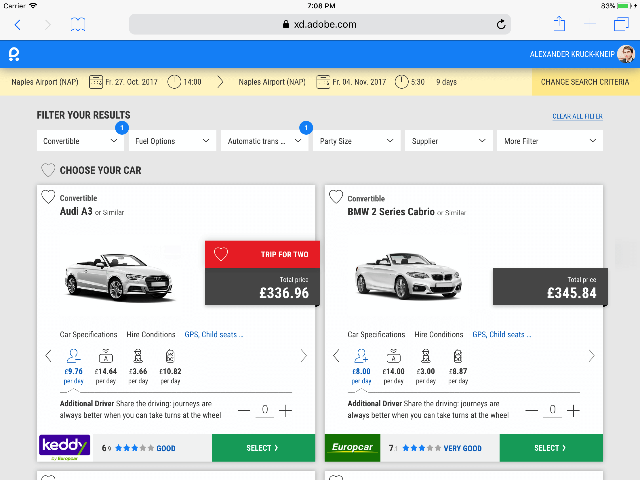
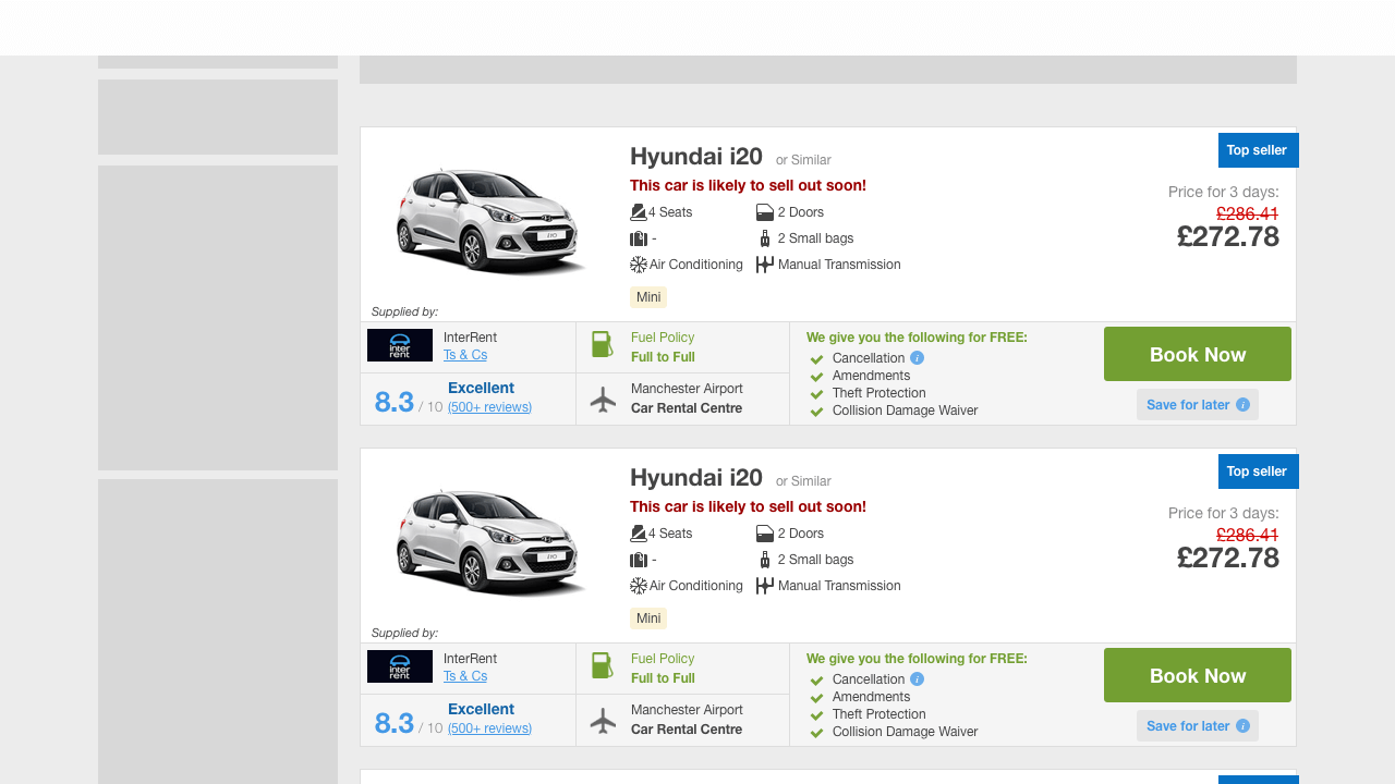
- Rentalcars.com is a very successful car hire platform from Manchester. Later in 2018 Rentalcars joined Booking.com under the new name BookingGo. I took an up to date screenshot from their website and you can still find some of the elements I had designed.
- For example I had put a lot of effort in overworking the icons next to the car image which resulted in a very successful A/B experiment.
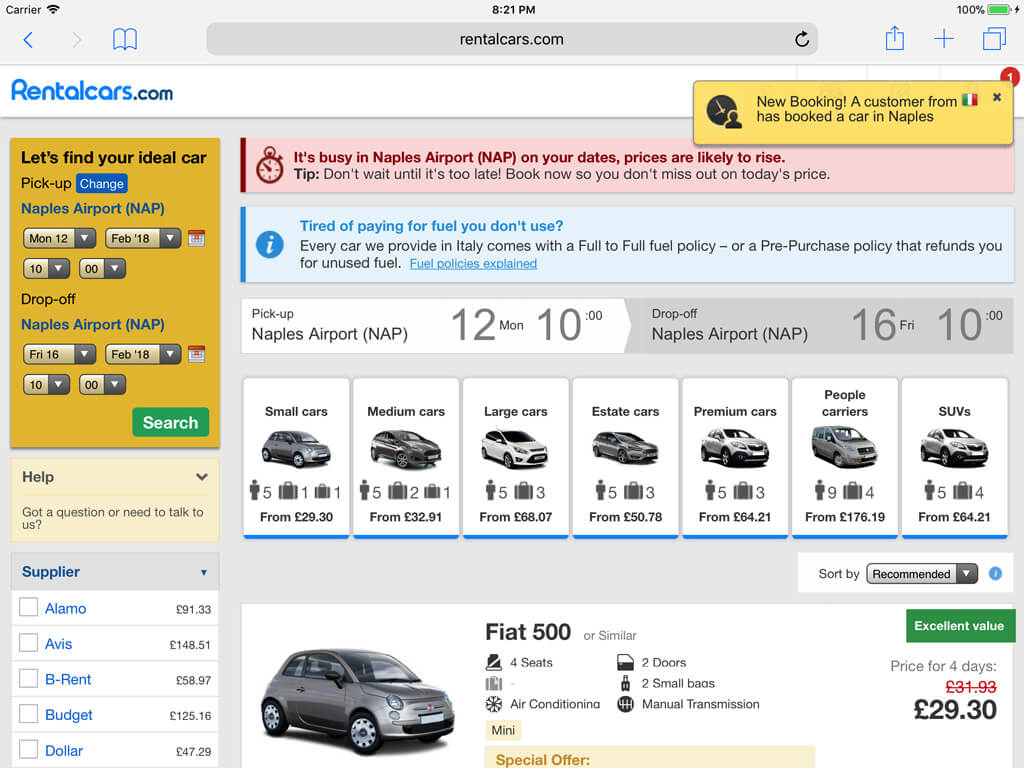
Working at Rentalcars.com
Main KPI more BPD
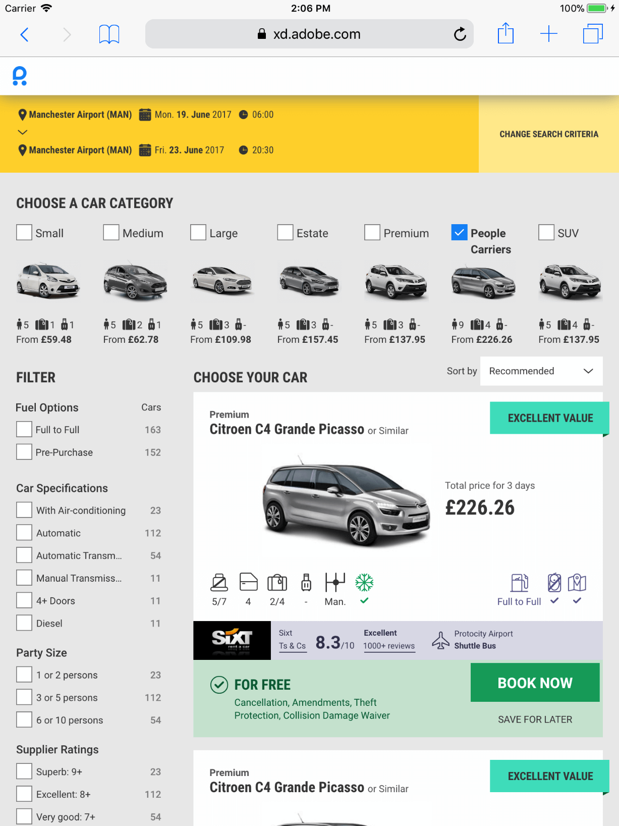
- Rentalcars.com had a very clear main KPI (Key Performance Indicator), increasing BPD (Bookings Per Day). An A/B test platform provided the data which helped to decide whether a change on the platform was making more bookings or not.
- On this old screenshot for example you can see on the top of the page the urgency messages which led to very successful A/B experiments.
Working at Rentalcars.com
Crossfunctional teams and ideation
- Crossfunctional teams with developers, designers and product managers were responsible for a specific part of the user journey. Our international team took care of the 'loading', the 'search results' and the 'car extras' pages.
- One source for my ideas have been vision prototypes, which I had discussed and tested with management, colleagues and customers.
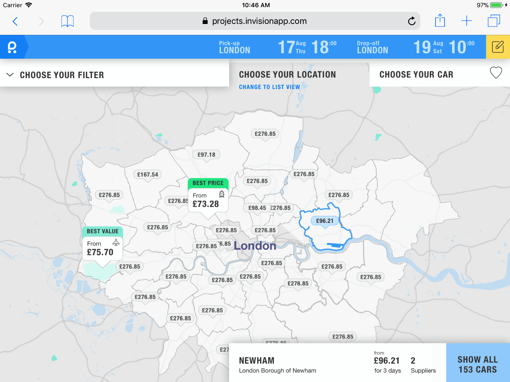
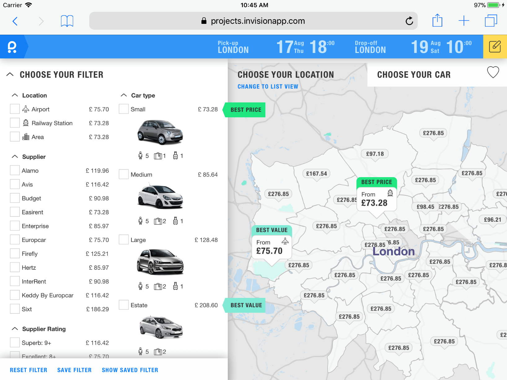
UI Design visions
Map focus design study 1 of 3
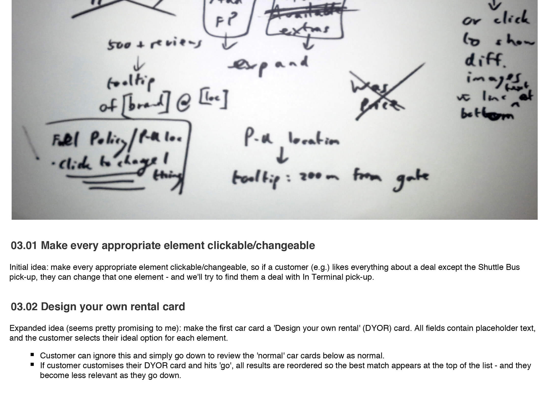
- Part of my role as UX Designer in our team was keeping in touch with our user researchers. Customers complained about the fact that it was too busy on our map search to really interact with it. In this UI design study I used the prototyping tool 'Sketch' together with screenshots from real maps I had coloured before with a free tool by Google.
- You can see on the screenshot how this helped to create a design that would allow more focus on what is important for our users.
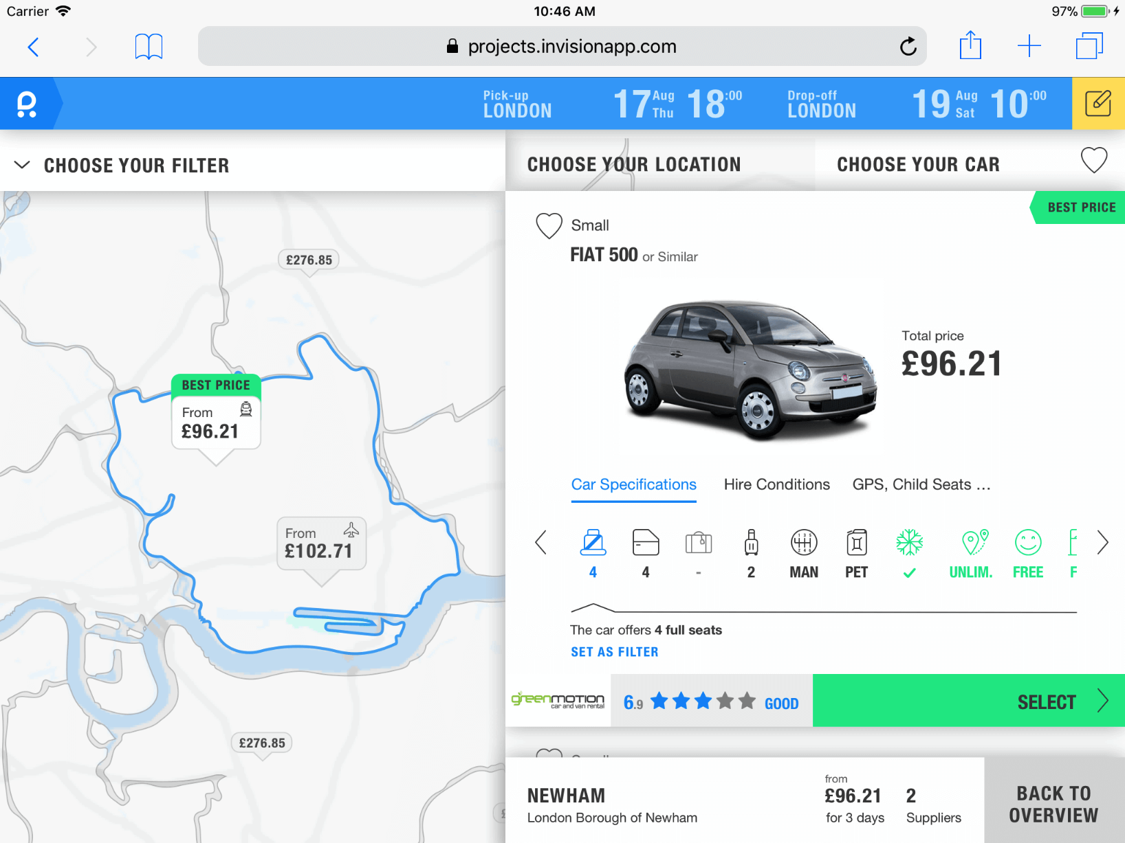
UI Design visions
Map focus design study 2 of 3
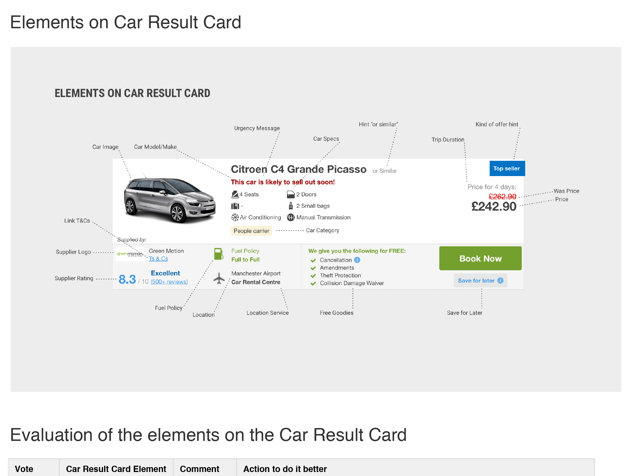
- On this screenshot, showing the car details area together with the map, my passion for iconography and white space is very recognisable. It was still the time where not every tablet had a Retina display so icons needed to support low resolution screens.
- This UX Design approach allowed bigger icon sizes and more accessible information on the car card.
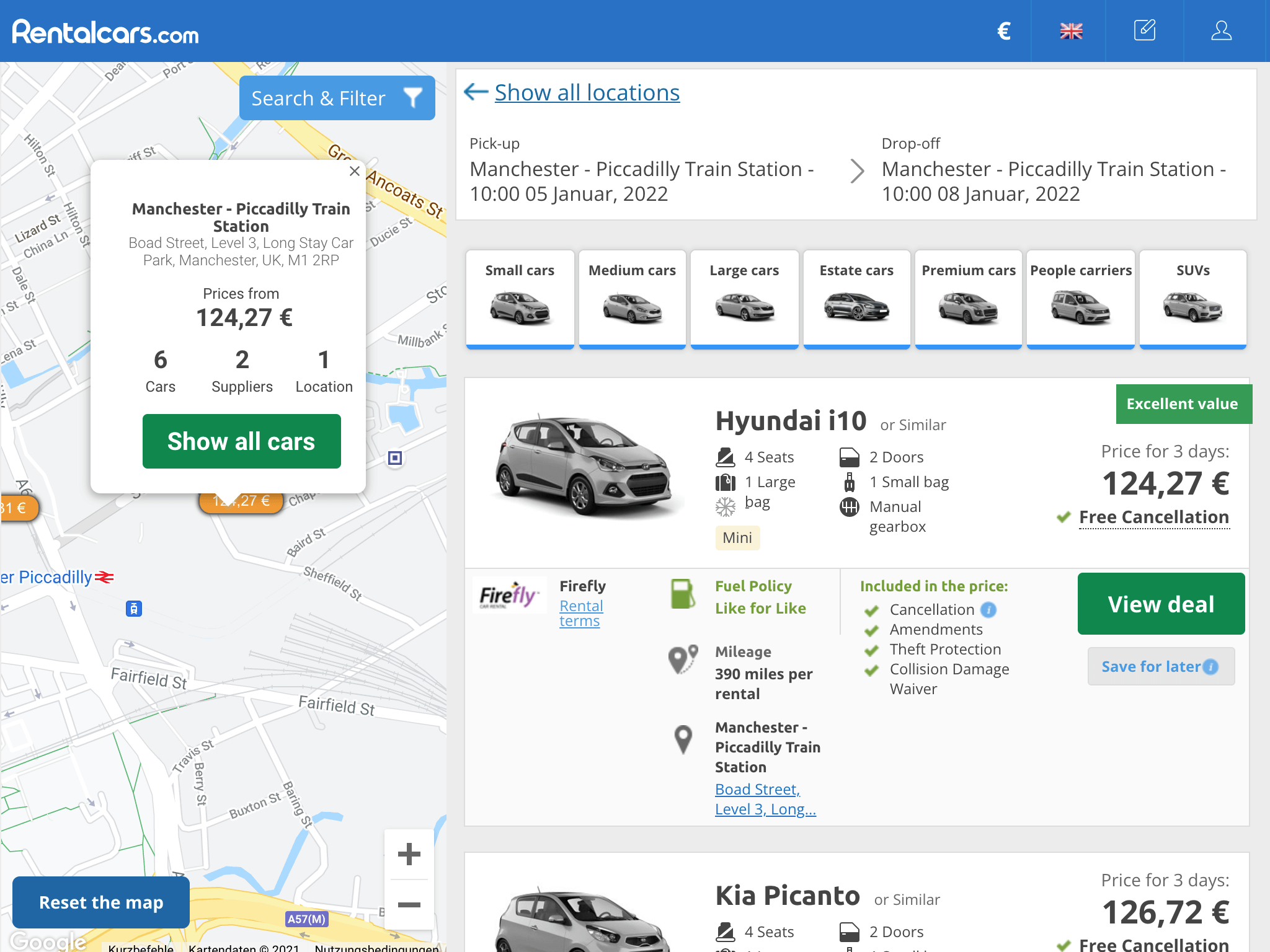
UI Design visions
Map focus design study 3 of 3
- On this screenshot from the current Rentalcars.com webpage you can see that some elements of the study are still used in the latest UI design. For example the car details are shown next to the map and the price message has a green background and still sits on the top right.
- Personally I think the clarity of the information was much better in my UI design study. Unfortunately, A/B testing did not allow such big design changes.
UI Design visions
All brand UI study 1 of 2
- A huge issue was that a brand team had created a lot of great assets for the UI design. Now there were a good bunch of icons together with amazing new colours. The problem was though, changing every colour or icon in a big bang approach would not align with the ruling of the A/B testing method.
- This screenshot shows a completely different search page design using the new brand colours and icons.
UI Design visions
All brand UI study 2 of 2
- As I reviewed the design of this search result page, I recognized an idea that could be used to solve a user need that was discovered by our research team. Users had difficulties to recognise that the 'top car category filter' was just like the filter list on the left. Therefore, having all filters on a similar grey background the component areas' hierarchy was more clear for users.
- Part of these UI ideas were again sources of A/B experiments that were very successful.
UI Design visions
Multiple role sketching session 1 of 6
- Another great source of inspiration are wonderful colleagues from all kinds of different teams and backgrounds. Besides the weekly ideation sessions with my product team I organised sketching sessions open to everyone. The topic of the workshop that I will walk you through was again inspired by feedback from our research team.
- Users wanted to be able to compare prices of cars on the 'search results' page when they make changes on the 'car extras page'.
UI Design visions
Multiple role sketching session 2 of 6
- Following design thinking principles I started with empathising together to get everyone on the same page. On the screenshot you can see a diagram I created to especially explain to external colleagues the environment of the problem we are trying to solve. To define our user groups and their missions, we had support from our colleagues from marketing with the latest update of their research on it.
- With a better understanding of our users in mind the next step was explaining the user pain points reported by user research.
UI Design visions
Multiple role sketching session 3 of 6
- The next part of the session is the one participants are most afraid of, sketching. Because of positive experience in previous workshops I used a reduced version of the Crazy 8 method. I asked everyone to take as much Din A4 paper they need and sketch down in 10 minutes a maximum of 5 idea concepts.
- Simply explaining that I reject this method and only expect half or no sketches from everyone really lifted the mood among the participants.
UI Design visions
Multiple role sketching session 4 of 6
- After the sketching every participant got 2 minutes to present their ideas to the group. Following the presentation, each presenter got an additional 2 minutes for a Q&A about the concepts shown.
- It is very important to give everyone the same time slots to try to avoid anyone receiving more biased attention.
UI Design visions
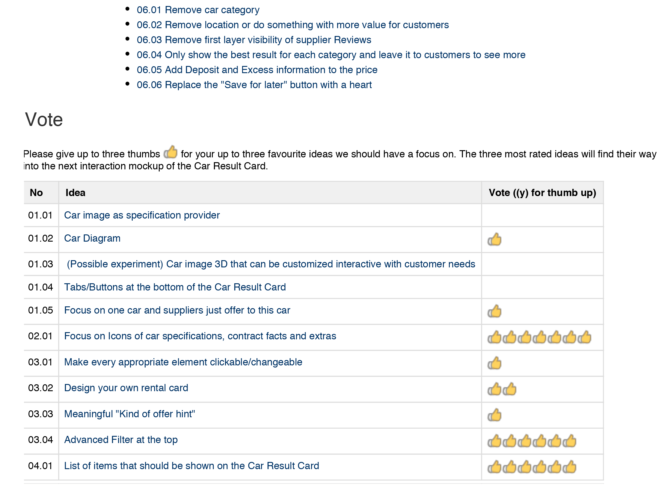
Multiple role sketching session 5 of 6
- It is not feasible to do this kind of workshop on a high frequency due to the need of having a time slot of minimum 2 hours available. Since I wanted to enable a large number of colleagues from different teams to come, I experimented with outsourcing the part of choosing the best idea. I documented the different ideas in confluence and sent the link with a deadline to vote on to the colleagues after the workshop.
- This also helped more introverted colleagues to have a similar neutral stage to present their ideas.

UI Design visions
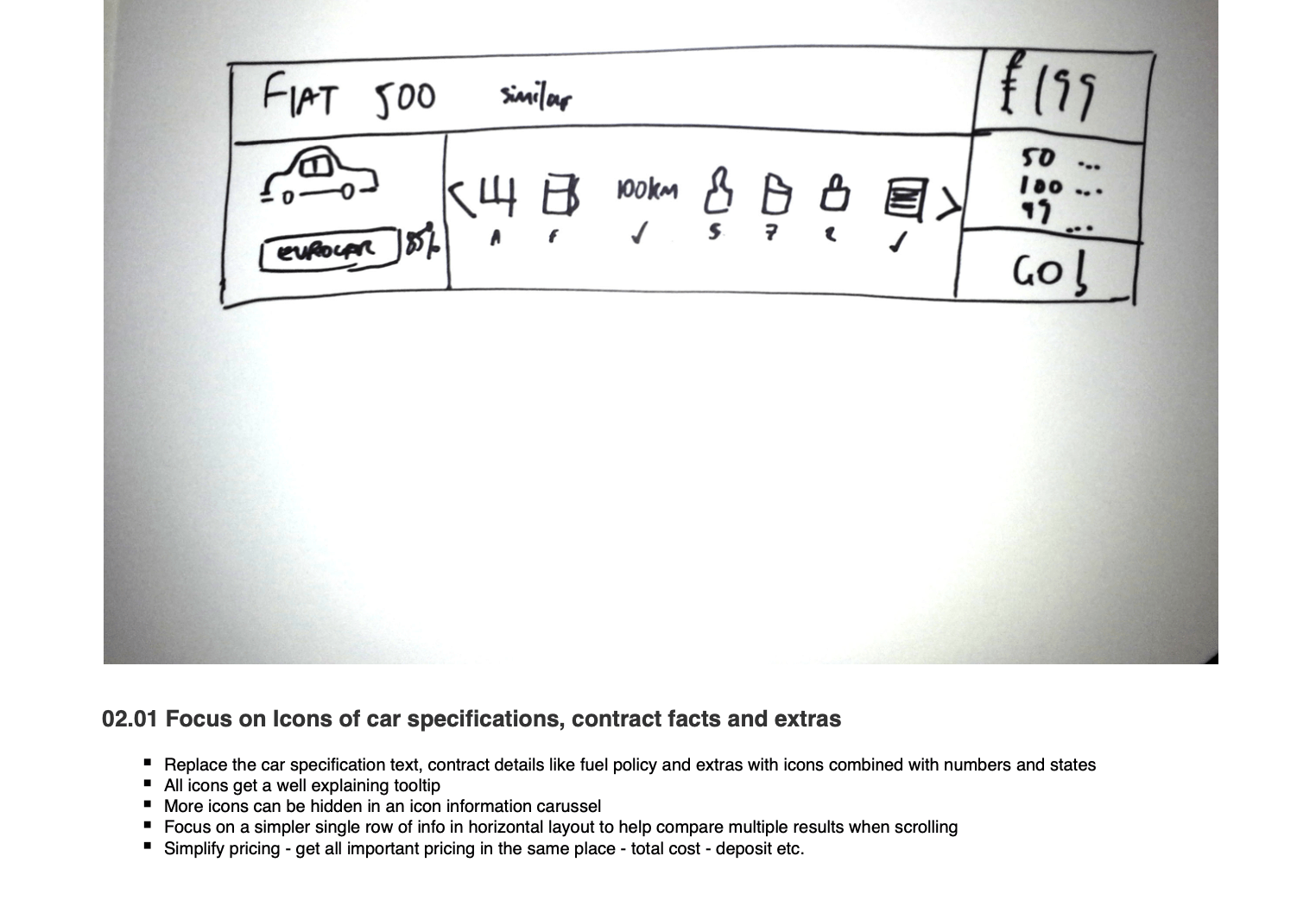
Multiple role sketching session 6 of 6
- The screenshot on this page shows the hi-fi prototype I had created to test the most voted ideas. The tested concepts have been: 'Focus on Icons of car specifications, contract facts and extras', 'Advanced Filter at the top' and 'List of items that should be shown on the Car Result Card'.
- The results of the testing were really promising and inspired the very successful reduced A/B tests later on the Rentalcars.com platform.
Topic 03
A/B test success stories
- There were three different categories of experiments on the A/B test platform at Rentalcars.com. The red failed ones that generated fewer than 90 more bookings per day, green experiments that generated between 90 and 95 more bookings and the gold experiments with over 95 bookings per day.
- Only a very small part of the experiments were of the gold category and were celebrated by the team like a victory in football.
A/B test success stories
Competitor analysis 1 of 3
- Rentalcars.com was a fast paced environment with individual responsibility of the product teams to reach high quarterly goals to increase bookings. Under these conditions, those who do the bare minimum in order to generate the maximum possible short-term success will be rewarded. As a result, after a long series of successes, the quality of the code has suffered significantly.
- During such a code maintenance crisis, the team asked me to develop only very small experiments but with enough potential to reach our quarterly goals.
A/B test success stories
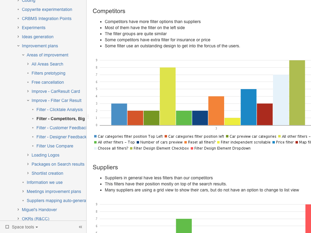
Competitor analysis 2 of 3
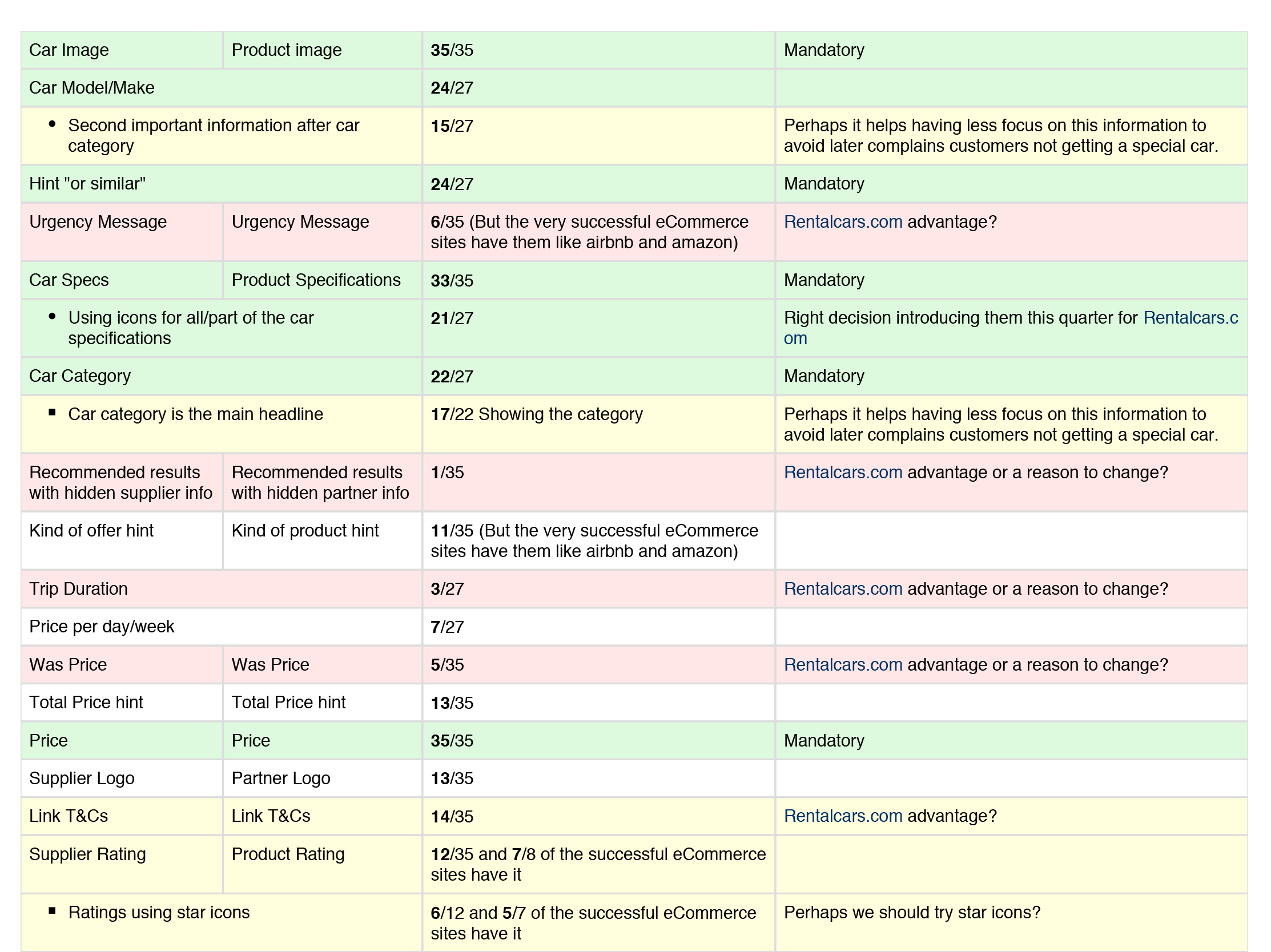
- By using Confluence from Atlassian, it was now possible to create huge but manageable tables combined with an appealing layout. I applied this new feature to set up a table in order to compare 30 different features/elements with 10 direct competitors, 17 biggest suppliers and 8 world best ecommerce companies.
- Altogether, I manually created a matrix of 1050 intersections.
A/B test success stories
Competitor analysis 3 of 3
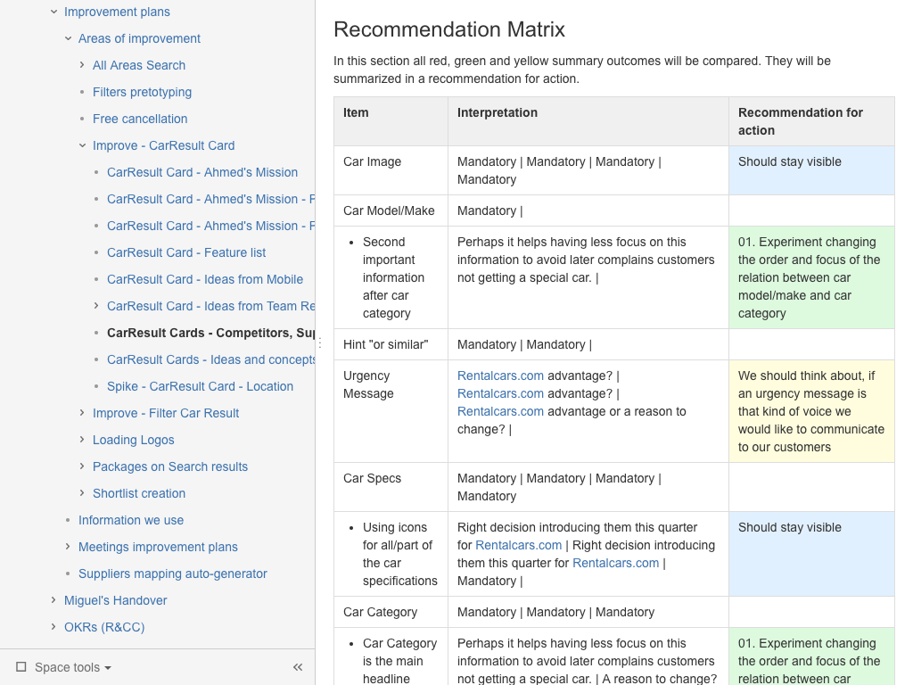
- With this approach I was able to quantitatively compare the use of features and elements. This data made it possible to set up a recommendation matrix that helped to find the low hanging fruit with the highest impact and lowest demand on dev resources. The idea was to open the car details in a new tab with one single line of code.
- This gold experiment brought +103 more bookings per day or more than 1.1M in revenue per year.
A/B test success stories
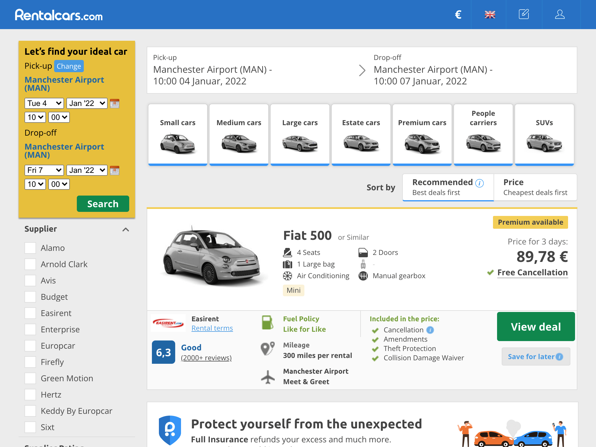
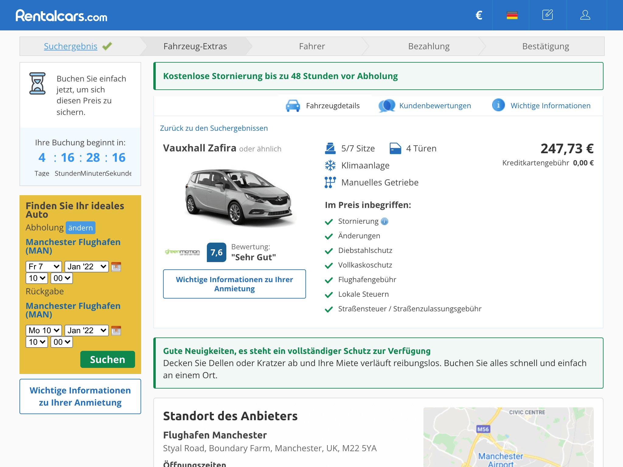
Latest UXR demands 1 of 3
- As mentioned before, it was my responsibility as the UX Designer in the team to maintain the relationship to the global user research team of Rentalcars.com. Following recommendations from our UR team, made it more likely that an experiment was successful since we tried to solve a real user problem.
- This time we were asked to do something to make it easier for our customers to compare the specifications of a car.
A/B test success stories
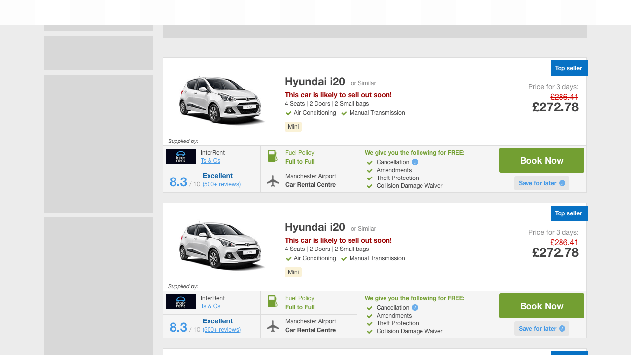
Latest UXR demands 2 of 3
- Based on the current design shown on the screenshot before, I created different variants with more or less changes. The design shown here, also tries to implement the brand design elements like the new icons and colours. Together with the product owner, we decided to take another prototype to start an experiment.
- If we changed too much for the brand design, we would not know which element would have made the difference if it failed.
A/B test success stories
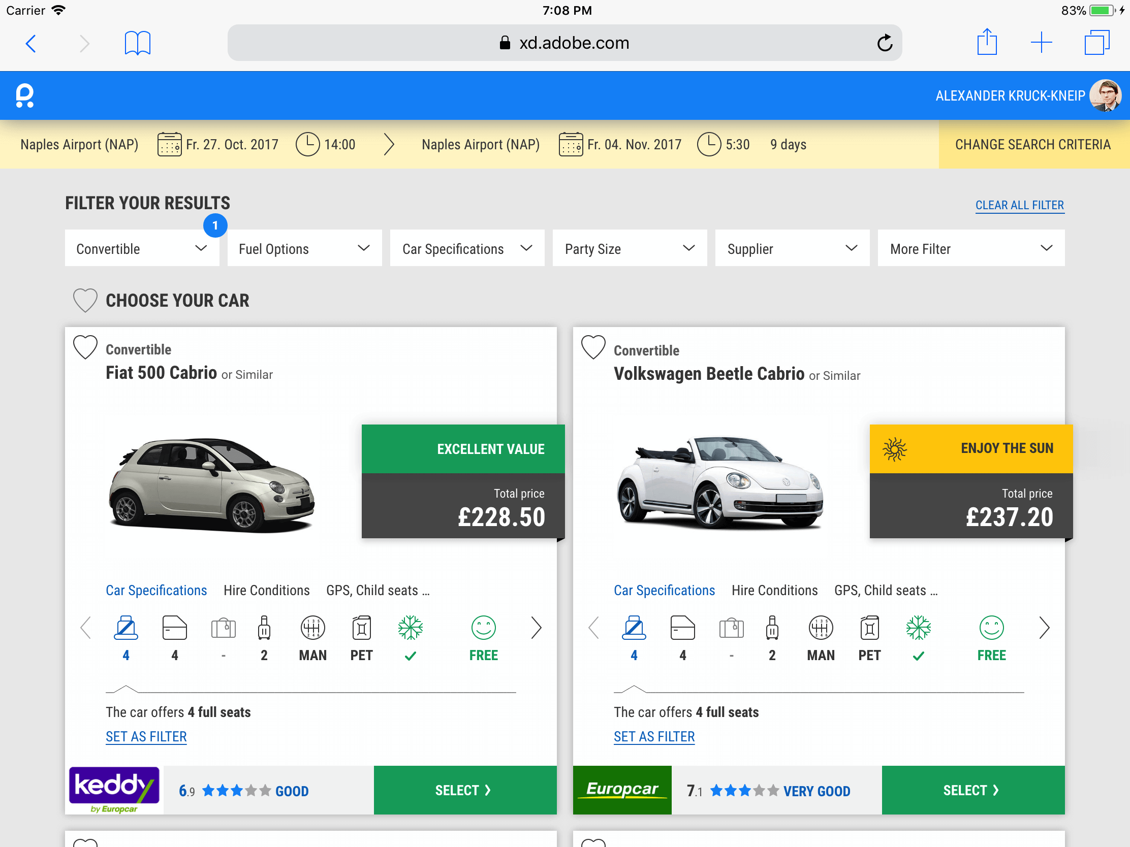
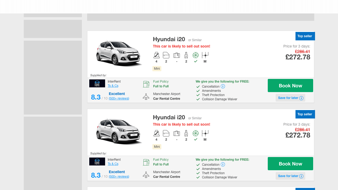
Latest UXR demands 3 of 3
- For changing the small area on the screen I was able to build on experience from vision prototypes I designed before and a set of low resolution ready icons I had created. When you scroll to the screenshot from the current page you can see that they are still in use after years.
- The experiment result was skyrocketing and brought us +116 more bookings per day or 1.2M more in revenue per year.
A/B test success stories
Following my design visions 1 of 2
- Earlier design visions are a useful source of ideas for powerful A/B experiments. On the screen you can see a vision of a search results page with all filters on a similar design hierarchy level. The hypothesis was: if users can easier navigate through our filters they are more likely to find the car they are looking for.
- And if customers find what they are looking for we assume that they are more likely to book with us.
A/B test success stories
Following my design visions 2 of 2
- The experiment wasn't as strong as hoped, but it was in the green and in consultation with the PO it was released for the whole user traffic. From a design perspective, we were just happy that it was occasionally possible to follow coordinated design principles.
- At least this experiment was bringing +92 more bookings per day or nearly 1M more in revenue per year.
Small design system sandbox
Responsible for the whole user journey
- Goal of the insurance team was to sell the new Rentalcars.com travel insurance as an 'upsell product'. Drawing attention to the new product could make sense at every point in the user journey. But why something in HTML, CSS and JS next to Sketch prototypes?
- At Rentalcars.com it was easier and quicker to create experiments when the UX Designer also took care of the frontend code.
Small design system sandbox
Front end code without framework
- There was no frontend framework I could build on for the implementation of the experiments. The only thing sure was, that I was able to build with JQuery JS to support interactions within the experiment code.
- Everything needed for the A/B test had to be delivered in a capsule peace of code with no outside dependencies.
Small design system sandbox
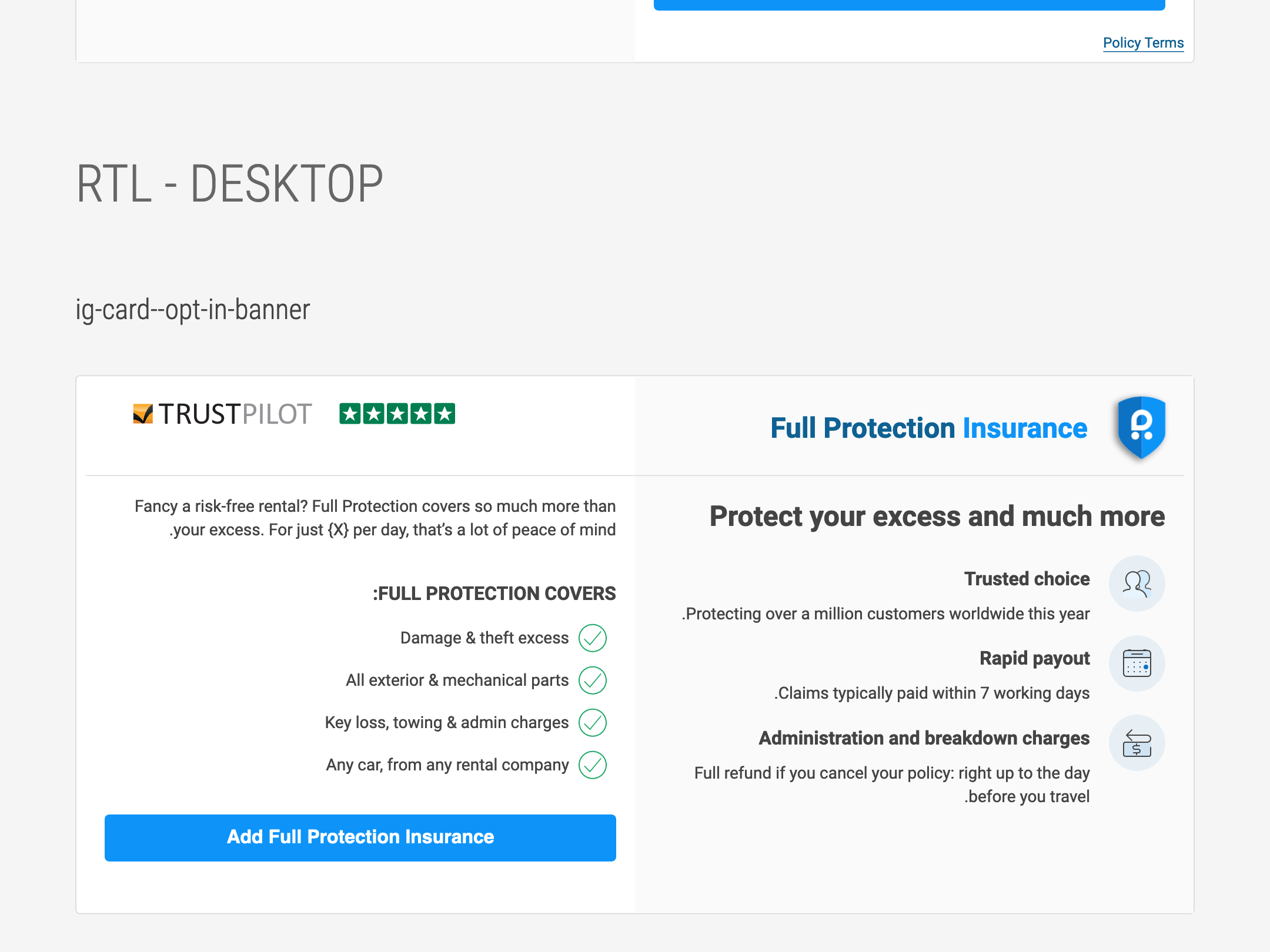
Rtl language support
- To guarantee the consistency this little selfmade frontend development environment was super helpful. Especially for experiments for countries that required rtl language support.
- With this way of working I could test the experiment myself on diverse browsers and android or apple devices.
Small design system sandbox
Brand consistency for the first time
- The GULP environment also allowed me to quickly convert icons I had created into vector based SVGs and use them accross all items I created with it. So it was finally possible to use the new brand design elements on all new components I designed for the insurance group.
- Visit rentalcars.com and I'm sure you will find one or the other element still in one of the insurance ads on the page.
Topic 05
Conclusion
- Working for Rentalcars.com in Manchester was a UX Design maturity booster for me. I learned to work in a high paced environment, be ok with data telling me that 90% of my experiments are for the bin and I had awesome international colleagues to go with me through this life journey. But I also noticed that the UI design was going in circles and from then on it was time to take the next step.
- A/B testing brings money and success quickly but without growing in design maturity it will never allow an awesome user experience.